 loading
featuresLove it? Hate it? Or both?An architecture critic revisits the building he despised as a student, and has a revelation. Blair Kamin '84MEnvD (Master of Environmental Design), architecture critic of the Chicago Tribune, is a past winner of the Pulitzer Prize for Criticism.
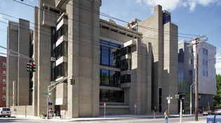
 Richard BarnesThe A&A Building, now called Paul Rudolph Hall, was renovated from top to bottom. At the same time, an addition known as the Jeffrey Loria Center for the History of Art (right) was built to the north of the building. View full image"Just one thing I want you to know up front," I replied when the editors of this magazine asked if I'd come back to New Haven to review Yale's restored Art & Architecture Building. "As a student, I hated it." In the early 1980s, some two decades after the building's opening, it was easy to hate the Art & Architecture Building (or the A&A, as everyone called it). Those years represented a high-water mark for postmodernism and its nostalgia for historic architecture; as a result, in the cruel way that the tides of architectural taste are wont to turn, the reputation of the building's daring modern architect, Paul Rudolph, was at low ebb. Many of us nonetheless appreciated Rudolph's poured-in-place concrete castle and how it magnificently culminated the march of Yale's arts buildings up Chapel Street. Living with it -- and, especially, inside of it, as a graduate student struggling to wrap my arms around a vast body of architectural knowledge -- was another matter. The jagged edges of Rudolph's signature concrete walls, which threatened to cut clothes and skin, were only the beginning. At any given time, a third of the lights were burned out. The original bright orange carpets had turned a sickly green. Everywhere, partitions sliced up Rudolph's flowing, vertiginous interior spaces. Raw concrete was ubiquitous -- on the walls, the ceilings, the floors. The place, in short, was parking-garage tough. My dehumanizing experience there was hardly unique. Rarely have soaring architectural ambition and the simple quotidian needs of users clashed as violently as they have at the corner of York and Chapel streets. There is a famous story about a client of Frank Lloyd Wright's furiously telephoning the master from the middle of a dinner party as water from a leaking roof drip-dropped down on his bald head. Wright's cavalier reply: "Move your chair." The trouble was, we art and architecture students couldn't move our chairs, our models, or our canvases, at least not out of the A&A. We were trapped in this unforgiving structure. An architecture school building is supposed to be a model, inspiring students and perhaps offering them something to emulate. For me, at least, the reverse was true. I would emerge from Yale seeing the A&A as a tyrannical object lesson in what architecture shouldn't be -- an exercise in willful, self-indulgent form-making that elevated the ego of the architect above the spirits of a building's users. So, this September, as I stood across York Street from the A&A at 10 p.m., I couldn't believe my eyes. Light poured outward from the building's vast windows and illuminated its grand interior spaces and the plaster casts of architectural decoration that hang on their walls. I had made a point of visiting the building late at night because that was when its gloom had weighed most heavily on me as a student. But what I found was a light box, perfectly revealing Rudolph's desire to create a captivating spatial drama. I had never seen this before. Now called Paul Rudolph Hall and due to be rededicated on November 8, the freshly restored A&A is no longer a freestanding building but part of a single interconnected structure with two other main parts, a new history of art building and a new library that joins the lower levels of the two structures. It is an enormously complicated, $126 million undertaking, energetically directed by New York City architect Charles Gwathmey ’62BArch, and it has achieved mixed results.
Gwathmey's masterful restoration of the A&A, skillfully and lovingly done, fully recaptures the lost glory of this modernist icon. His banal addition, the Jeffrey Loria Center for the History of Art, is nowhere near the icon it sets out to be. But it is at least commodious and, in truth, the triumph of the restored A&A would have been impossible without it. Gwathmey cleverly shifted elevators, mechanical systems, a reception area, and some faculty offices out of the A&A and into the new building, where they serve both structures. He thus freed the A&A to be what I suspect Rudolph always wanted it to be -- a dazzling piece of architectural sculpture, unfettered by niggling everyday concerns.
|
|