 loading
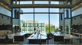
Love it? Hate it? Or both? Richard BarnesThe building's original large panes of glass had been replaced with multiple narrow insulated windows in the 1990s. New windows (above, seen in the fourth floor studio) are energy efficient but have dimensions more like the originals. Across the street is Louis Kahn's 1953 addition to the Art Gallery, which reopened in 2006 after a renovation. View full imageFor the A&A, at least, the project has yielded superb results. It was no accident that I found the building's exterior so wonderfully transparent. Gwathmey specified large new windows to restore Rudolph's original see-through look, which had been compromised by previous renovation. (The windows are insulated; the project is expected to qualify for a Leadership in Energy and Environmental Design silver rating.) He also attended to critical details, bringing back a new version of the concrete spandrels below the windows. Their sleek forms recreate a vivid counterpoint with Rudolph's rough-edged concrete. The concrete itself, cleaned with water and bleach, even looks a tad less menacing. Inside, you get the sense that Rudolph would have made his atrium cut through the entire building -- if only the fire marshal had let him. In the fourth- and fifth-floor drafting area, the partitions that chopped up Rudolph's grand expanses have been removed, and two U-shaped concrete bridges span the drafting area, restoring a key element of the original design and providing a bracing look-out point from which to admire a replica of the long-gone Minerva. Here, space flows in completely unexpected ways -- up, down, in, out, sideways. Light entering through skylights bathes the muscular concrete columns, making this cathedral of work the perfect distillation of the modernist trinity of space, light, and structure. This time around, though, God is in both the big picture and the details. Bright lights and orange carpets are everywhere. New ventilation equipment makes the air move instead of being deadly still. "It definitely feels different," said Steve Ybarra ’05, a second-year Master of Architecture student. The building seems sure to remain in good order as long as Stern is in charge. He's a detail fanatic. Even though he was dressed in a custom-tailored English suit on the day he took me around the building, he was pulling weeds out of planter boxes on the A&A's roof. "I take care of this joint," he cracked. While the history of art building has some memorable moments, particularly a dramatically raked main lecture hall, it simply can't match the punch of the restored A&A. Taking a break from his drafting table, junior Russell LeStourgeon described the A&A's new success well. "Before it was like a cave, like ruins," he said. "Now it's preserved ruins. We pulled our first all-nighter and at sunrise we went out on the roof. We felt very in touch with Rudolph." I felt the same as I left the A&A. It seemed tragic that Rudolph's masterwork had led to his fall from grace. He deserved better than to be marginalized at the end of his career. It is fitting that the restoration at once celebrates him and sends the broader signal that, no matter how disheveled they appear, masterpieces of mid-twentieth-century modernism can and should be preserved. Before, I hated this building. Now I love/hate it. Surely its exemplary restoration will inspire new generations of students -- and serve as a cautionary tale against the brilliant but arrogant form-making that got the A&A into such hot water in the first place.
The comment period has expired.
|
|