Beinecke Library
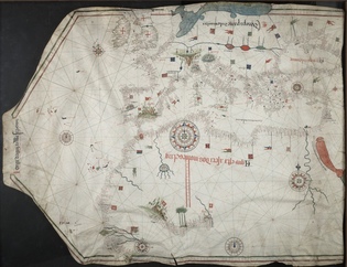
There are maps that guide travelers, and there are maps that are meant to impress. Given the elegance of the 1492 map shown here, Jorge d’Aguiar appears to have aimed for the latter. The map is about 32 inches across and 41 inches wide.
View full image
Medieval and early modern navigators of the Mediterranean and the Black Sea had no telescopes to help them guide their ships into port. But they had maps: specifically, portolan charts, which showed where to dock and how to avoid dangers. Portolans were used for at least 500 years. The earliest surviving portolan is the Carte Pisane, a fragment dating from the end of the thirteenth century. The Beinecke Library has a significant collection of portolan charts, dating from 1403 to 1789.
Portolans are renowned for their accuracy—which is remarkable, as early cartographers couldn’t see the coast from a distance. The coastlines list all the ports found in each region, with major ports shown in red letters and minor ports in black. Black dots represent shoals and other sailing hazards. As portolans were designed to be rotated to suit viewers at a communal table, they were not drawn with a distinct top or bottom. Although they were used for navigation aboard ships, surviving portolans were likely used primarily by merchants, pilgrims, and statesmen to help them better understand the geographic proximity of important trading centers.
The Aguiar Portolan of 1492 is one of only two surviving portolans that were produced in Portugal, the preeminent European sea power of the fifteenth century. In 1488, Portuguese sailors explored the west African coast from Sierra Leone around the Cape of Good Hope, and up the east coast of Africa to the Arabian Peninsula. The chart shown here reflects some of Portugal’s exploration, with an inset map that details the ports from Sierra Leone to São Jorge da Mina, a city in present-day Ghana. The Portuguese had built São Jorge da Mina in 1482 to facilitate the Atlantic slave trade. The Dutch captured the city in 1637. Every year, for 177 years, they enslaved roughly 30,000 Africans there. In 1814, the Dutch officially abolished the slave trade in their territories.
A beautifully colored portolan chart like this was unlikely to have been used on a ship, and its preservation indicates it was well cared for. Like most portolans, this one is in the shape of the animal’s skin. The map was likely fastened by a parchment tag or hemp thread that went through a hole in the center of the neckpiece.
Portolans were designed for use at sea, so, apart from such major ports as Genoa and Venice, they typically neglect inland features. Because this map was made in Portugal, and because Jorge d’Aguiar made the map in Lisbon, that city is prominently featured on the Iberian Peninsula. Northern Europe is only suggested, with no hint of Norway, Sweden, or Finland, and only a large blob for the waters north of Denmark. Some inland features are represented, probably because they had historical significance to the mapmaker: one can see Hadrian’s Wall, for example, dividing England from Scotland on the map.
The Red Sea is often depicted on portolan charts even though sailors in the Mediterranean couldn’t reach it. Here, Aguiar has written in Portuguese, alongside the Red Sea, that it’s not actually red—rather, the water reflects the red rock that surrounds it, giving it a red appearance. The Red Sea also has a land bridge, which represents the Jews’ exodus from Egypt when the Red Sea parted but then closed, drowning Pharaoh’s troops. While this information was useless to sailors, it provided historical meaning that might have impressed potential customers desiring a map of their own.
 loading